NYC Cycling Map + Graphic
A Data-Driven Cycling Map
As a cyclist and map enthusiast, I wanted to create a rich, interactive map of the Manhattan Waterfront Greenway, incorporating not only the bike route itself but also Points of Interest (POIs) and restroom locations. This project integrates multiple datasets, including a GPX tracks, geospatial data for POIs and restrooms, and custom map visualizations using Folium and Matplotlib.
Data Collection & Cleaning
The first step was to gather relevant data sources:
- GPX Track Data: The bike route was sourced from Ride with GPS (Manhattan Loop), containing latitude, longitude, and elevation data.
- Points of Interest (POIs) and Restroom Locations: I collected a list of interesting locations and public restrooms along the route including their GPS coordinates using google maps.
- POI Images: I collected and linked image URLs for POIs to enhance the interactive map experience.
- Converted GPX data into a structured DataFrame, separated POIs and Restrooms into distinct DataFrames and computed distance along the route by calculating cumulative distances between track points.
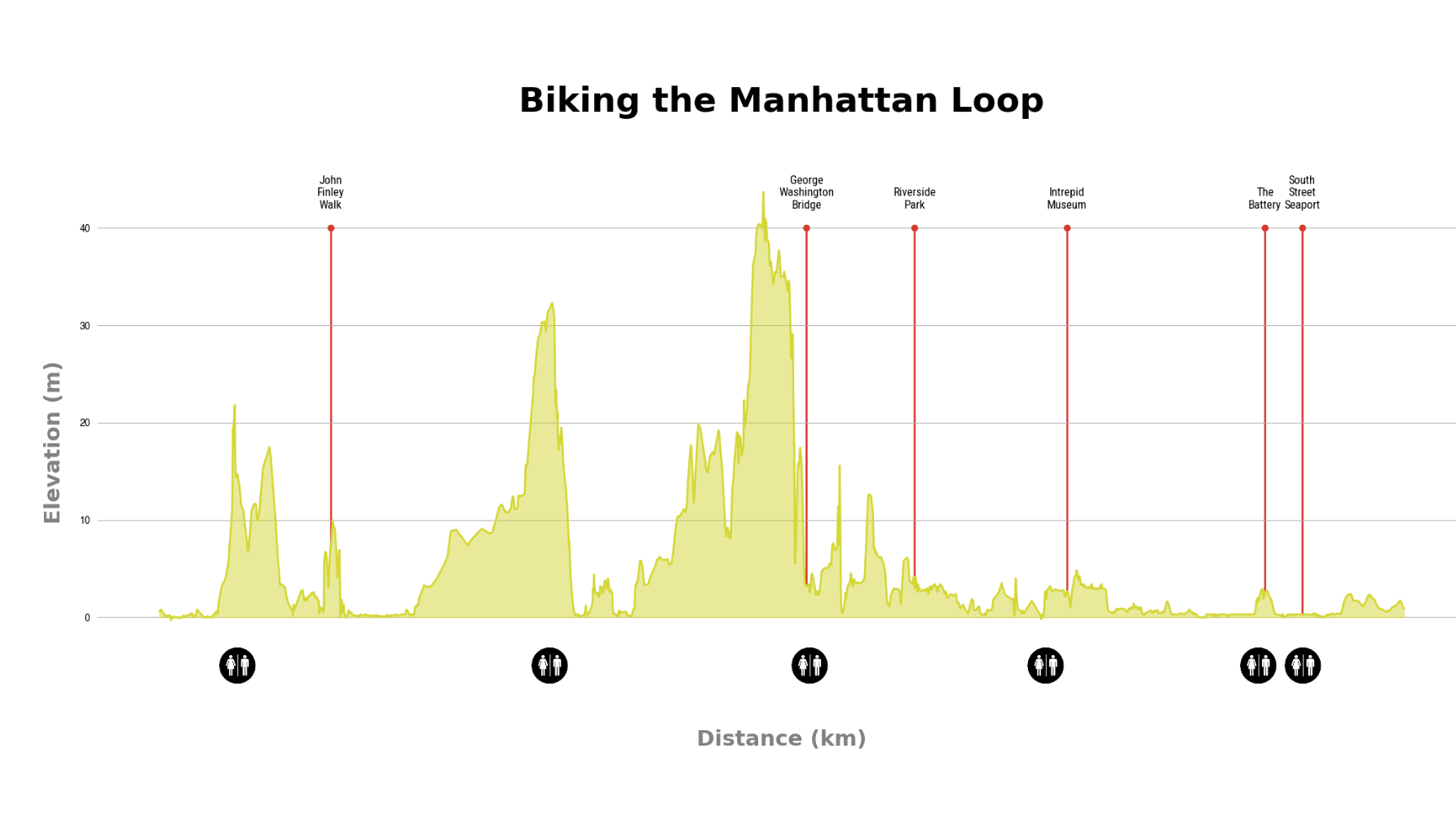
Elevation Chart with Matplotlib
To provide more context on the elevation along the route, I used Matplotlib to create an elevation profile and route visualization.

Interactive Map Creation with Folium
With the cleaned data, I built the above interactive Folium map:
- GPX Route: Plotted as a colored line to visually highlight the bike path.
- Restroom Markers: Placed at restroom locations without popups to minimize distractions.
- POI Markers: Include popup images when clicked.
- Styling & Customization:
- Included CartoDB Positron tile layer to enhance the visual appeal.
- Adjusted popup styles to ensure images display properly.
This interactive map allows users to explore the Manhattan Waterfront Greenway, some tourist areas and available public restrooms along the route so you know what to expect on your ride.
This project was a fun way to incorporate my skills in data visualization and python using Folium and Matplotlib and could be a great project idea for various travel, outdoor adventure or cartographic companies. Future improvements could include upgrading this to a fully interactive Dash dashboard using plotly and include real-time weather overlays, bike repair stations, or favorite coffee shops to further enhance the user experience.